LINDSAY BERARDINO
VISION EXECUTION PARTNER

THE STRATEGY BEHIND THE BRAND
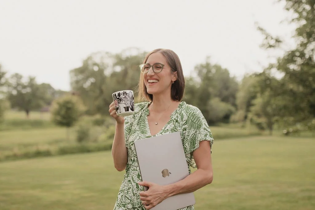
Lindsay came to me at a pivotal moment in her business. While her work had evolved far beyond traditional virtual assistance, her brand hadn’t caught up.
She wasn’t a task-taker—she was a strategic partner. A thinker. A calm, steady presence for visionary founders who needed help turning big ideas into real, sustainable execution. She wanted a brand that reflected that elevated role and naturally filtered in clients who valued collaboration, clarity, and depth.
Our goal was to reposition Lindsay as what she truly is: a Vision Execution Partner—someone who helps big-picture thinkers stay focused on where they’re going while she handles the details that make forward momentum possible.

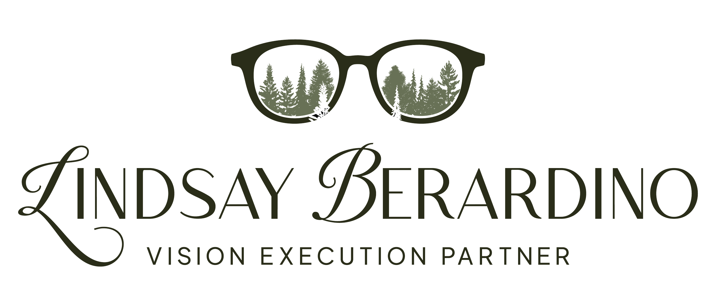
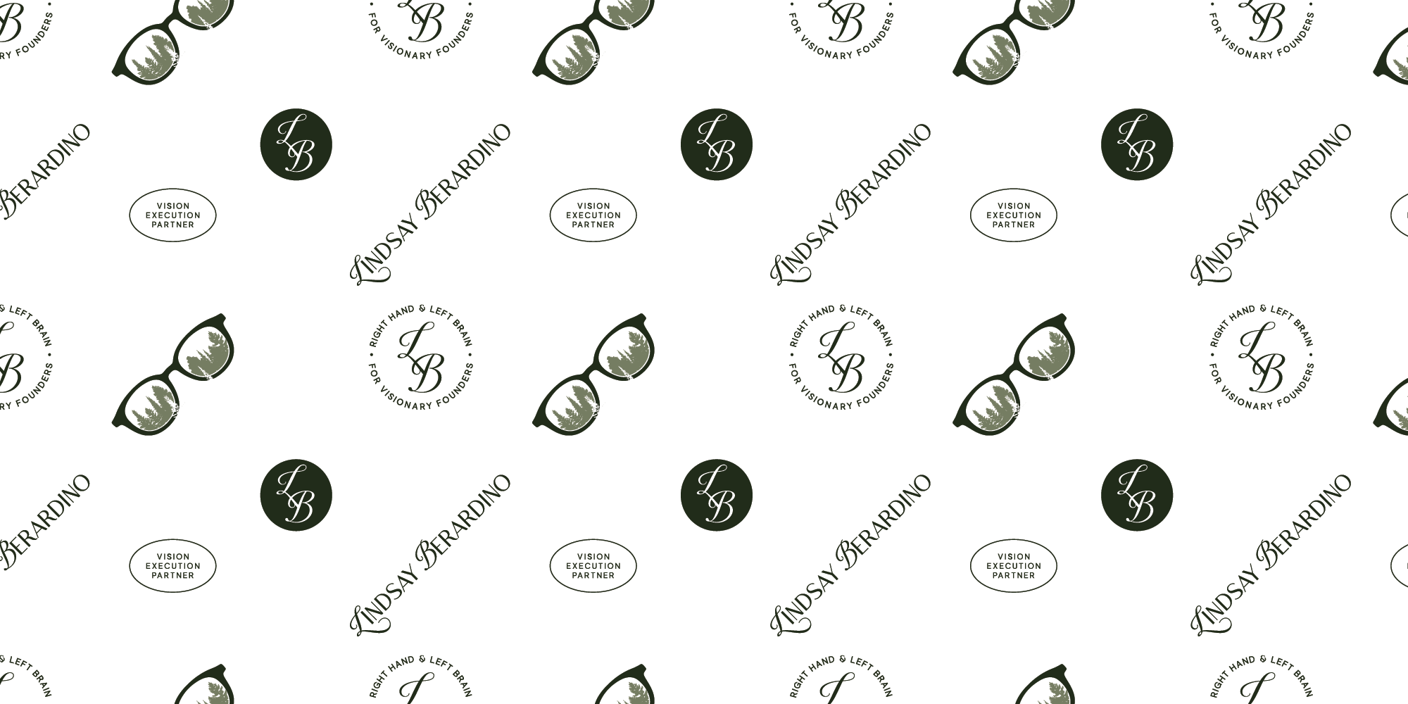
The creative direction centered around a simple but powerful idea: you can’t see the forest through the trees.
This metaphor became the heart of Lindsay’s brand. Her clients are visionaries—often able to see the forest, but overwhelmed by the trees. Lindsay sees the details. She holds the structure. She helps make sense of the path forward.
Visually, this came to life through a custom logo inspired by Lindsay’s signature glasses—an unmistakable part of her personal style. Within the lenses, layered tree silhouettes represent perspective, clarity, and depth. The mark subtly communicates what Lindsay does best: helping others see clearly by tending to the details they don’t want to manage alone. The concept felt immediately aligned—distinctive, meaningful, and deeply her.
SUPPORTING ELEMENTS
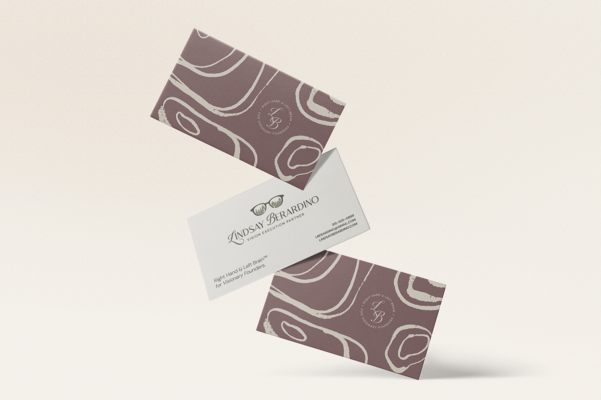
To support the primary logo, we built a visual system that feels calm, grounded, and quietly confident.
Soft earth tones anchor the palette, paired with a deeper accent color that adds weight without overpowering. Subtle linen and canvas-inspired textures bring warmth and tactility, while abstract topographic linework nods to Lindsay’s role as a behind-the-scenes trail guide—steady, intentional, and always thinking a few steps ahead.


DIGITAL PRESENCE
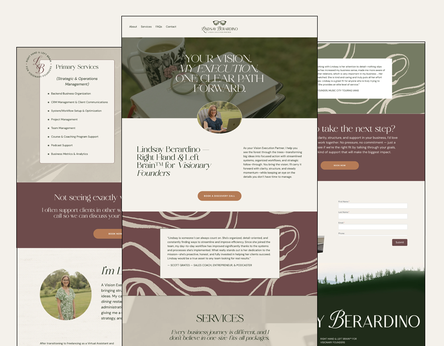
Lindsay wanted a simple but elevated one-page website—something that felt like a significant step up from the PDF she had been sharing previously. The goal was clarity, credibility, and ease: a digital home that clearly communicates who she is, how she works, and who she’s best suited to support.
The result is a brand presence that finally matches the caliber of her work. One that feels aligned, intentional, and built to grow with her—setting the stage for deeper partnerships and more spacious, strategic work moving forward.
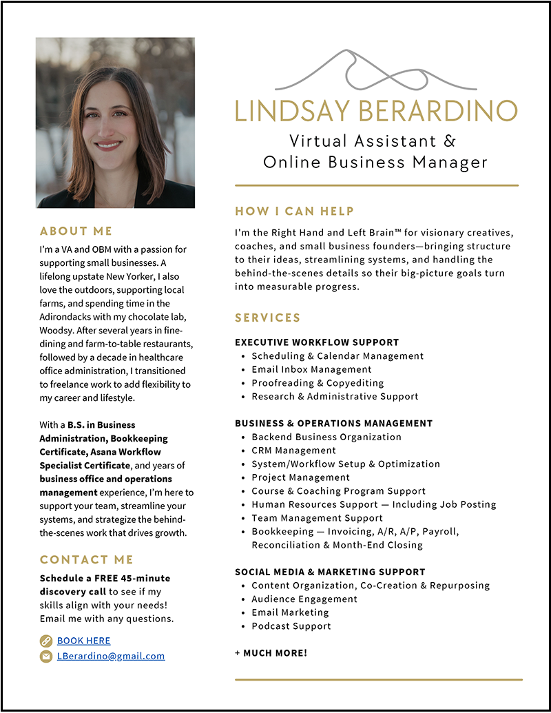
BEFORE
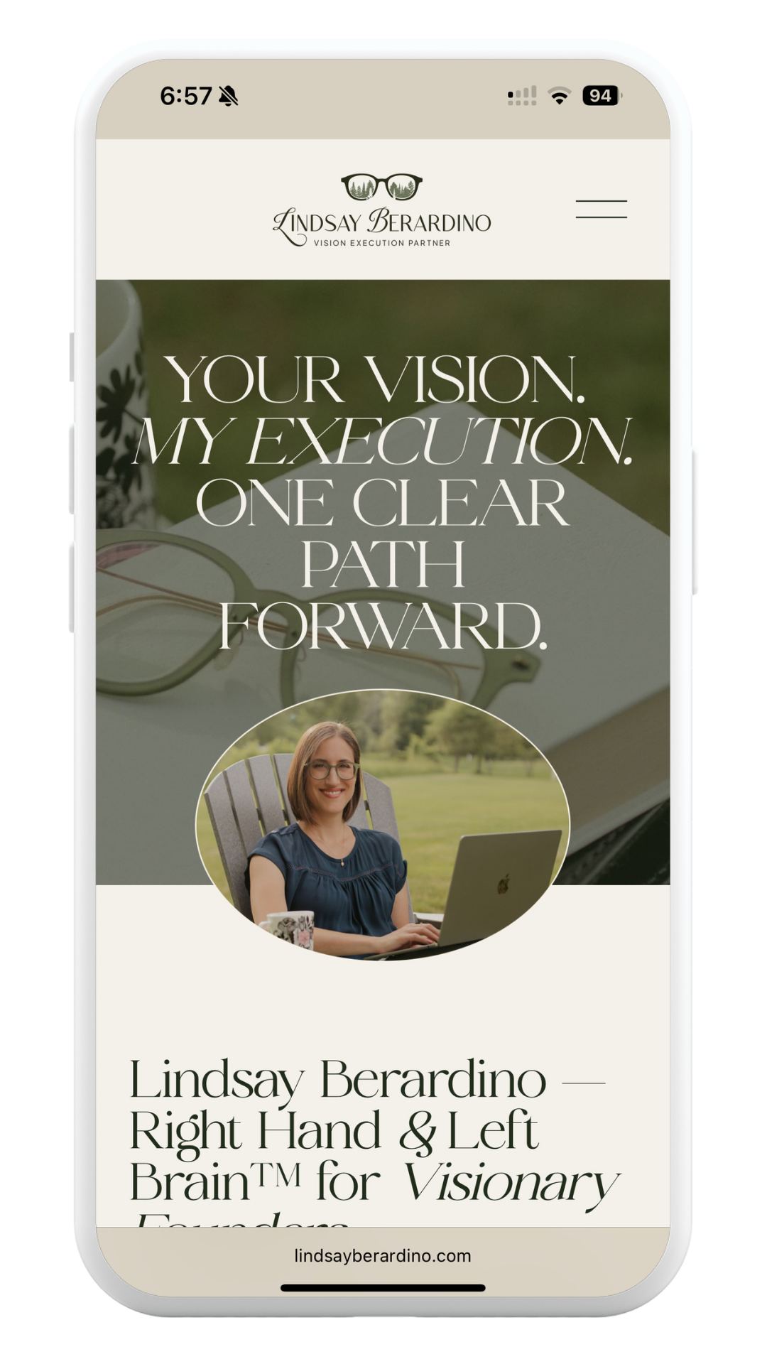
AFTER